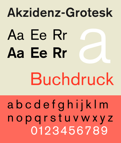
The International typographic style was introduced back in the 1950’s in Switzerland, by designers Josef Müller-Brockmann at the Zurich School of Arts and Crafts and Armin Hofmann at the Basel School of Design. Due to this reason the style is also called the Swiss style. The main aim of the movement was based on three important aspects which were; cleanliness, readability and objectivity. Main characteristics of the international typographic style are; asymmetrical layouts, use of sans-serif typeface rather than serif and also the use of the grid. Such sans-serif typeface they used was the “Neue Haas Grotesk” also known as Helvetica. This typeface is the one typeface which is used over and over again in advertisement, websites, traffic signs and more.
In the 50’s before the Helvetica, another typeface was created by Adrian Frutiger. This typeface named “Univers” was portrayed as a non-grotesque typeface and furthermore was an influence for Max Miedinger and collaborator Edouard Hoffman when the creating “Helvetica”.
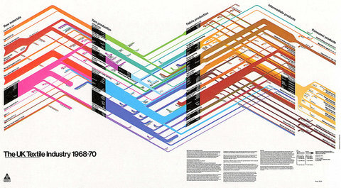
The international typographic style was all about neatness in their work. When designing the artists of the movement nearly always used the grid. This technique was for the artists to keep order in their work. After constructing the grid for the design the artists used to apply the text, usually aligned flush left, ragged right.
The style had a preference on choosing photography rather than illustrations and drawings due the same principles of the style which were; cleanliness, readability and objectivity. The style had also principles on the sans-serif typeface. They believed not just that sans-serif are neater than serif fonts but they believed that the typeface expressed the feel of progressive age and also, being set on a mathematical grid would make the text in its best to be legible and well-toned for structuring information.
Comparing the Swiss style with today’s designs, it made huge influence on contemporary artists. The principles of today are very similar. Re-branding of big companies are choosing a more simple designs than that of a complicated one, with flat colours and simple geometrical shapes the contemporary artists of today are keeping the Swiss style in action even after more than fifty years of its birth. For instance comparing magazines of the 21st century, the artists are still using a grid, even if it changed a little; it still exists in the eyes of the graphic designers.
In my opinion the international typographic style helped the contemporary artists arrive to the point where they are today. Great graphic designers are using more flat and simple shapes than fading, gradient colours and complicated shapes. Also the “Neue Haas Grotesk” us still used in contemporary designs; on electronic sites, traffic signs, magazines, and much more. The invention of the simplicity of the style still exists in the heart of the artists of today.
In the 50’s before the Helvetica, another typeface was created by Adrian Frutiger. This typeface named “Univers” was portrayed as a non-grotesque typeface and furthermore was an influence for Max Miedinger and collaborator Edouard Hoffman when the creating “Helvetica”.
The international typographic style was all about neatness in their work. When designing the artists of the movement nearly always used the grid. This technique was for the artists to keep order in their work. After constructing the grid for the design the artists used to apply the text, usually aligned flush left, ragged right.
The style had a preference on choosing photography rather than illustrations and drawings due the same principles of the style which were; cleanliness, readability and objectivity. The style had also principles on the sans-serif typeface. They believed not just that sans-serif are neater than serif fonts but they believed that the typeface expressed the feel of progressive age and also, being set on a mathematical grid would make the text in its best to be legible and well-toned for structuring information.
Comparing the Swiss style with today’s designs, it made huge influence on contemporary artists. The principles of today are very similar. Re-branding of big companies are choosing a more simple designs than that of a complicated one, with flat colours and simple geometrical shapes the contemporary artists of today are keeping the Swiss style in action even after more than fifty years of its birth. For instance comparing magazines of the 21st century, the artists are still using a grid, even if it changed a little; it still exists in the eyes of the graphic designers.
In my opinion the international typographic style helped the contemporary artists arrive to the point where they are today. Great graphic designers are using more flat and simple shapes than fading, gradient colours and complicated shapes. Also the “Neue Haas Grotesk” us still used in contemporary designs; on electronic sites, traffic signs, magazines, and much more. The invention of the simplicity of the style still exists in the heart of the artists of today.
Reference:
Design is History, N/A, Swiss Design. [Online] Available at: <http://www.designishistory.com/home/swiss/> accessed on: [22/11/14].
Wikipedia, 03/11/14, International Typographic Style. [Online] Available at: <http://en.wikipedia.org/wiki/International_Typographic_Style> accessed on: [22/11/14].
Britannica, 03/04/14, International Typographic Style. [Online] Available at: <http://www.britannica.com/EBchecked/topic/1080070/International-Typographic-Style> accessed on: [04/10/14].
