
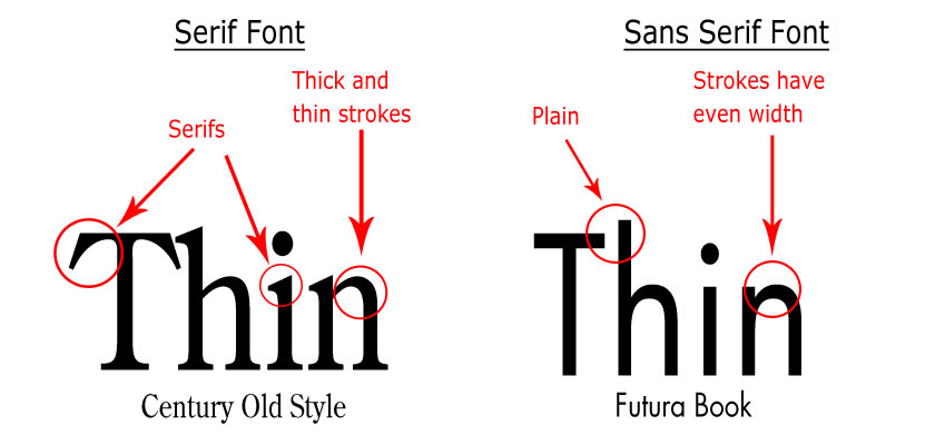
A type face can determine a logo or design to be good or bad. There are two types of typefaces, the Serif which is basically a line attached to the end of the stroke of the letters and the Sans-Serif which is a typeface without the serif. The word “sans” is a French word which means without.
The first Serif typeface was used by the Romans when they used to engrave in stone. Serif is mostly used for body text due to the reason that research shows that the Serif type face is more legible than the Sans-Serif. Such examples are long texts such as Newspapers, magazines etc… In Europe Serif is more common than North America. When dealing with on screen text more research resulted that the most preferred on-screen text is the Sans-Serif. In the world of today there are a big number of different styles of type-faces. Due to the screen resolution some Serif fonts are very difficult to identify and are usually hard to view the lines attached to the end of the strokes.
Serif type-face can be divided into four different sub-sections which are; old style, transitional, Didone and slab serif. The old style which is also known as Humanist dates back to 1465, in the same type when Guttenberg invented the first movable printing press and is defined by the diagonal stress. The transitional also known as baroque serif, were first seen in the mid-18th Century. It is called transitional for the simple reason that it is like a bridge between the old style and the modern style. Didone serif also known as modern serif, it is characterized by the extreme contrast between the thin and thick lines in the font. The final sub-section is the Slab Serif or Egyptian typefaces are characterized by the small difference between the lines of the font itself.
In today’s designs the Serif is still used for body texts, but by time the sans-serif fonts are replacing the Serif fonts for body texts. This is happening due to the fact that artists are always changing styles. If you take a contemporary design of a simple magazine it will be obvious that fonts change from Serif to sans-Serif. One of the most common sans-Serif is the “Calibri” which is one of the most common sans-Serif type-face. Another font which is also commonly used is the “Times New Roman” which is one of the most standard fonts for traditional printed newspapers. Sans-Serif is being used more than ever due to the evolution of design.
Reference:
I love Typography, June 20th 2008, A brief history of type-part 5. [online] Available at:
<http://ilovetypography.com/2008/06/20/a-brief-history-of-type-part-5/> accessed on: [11/10/14].
